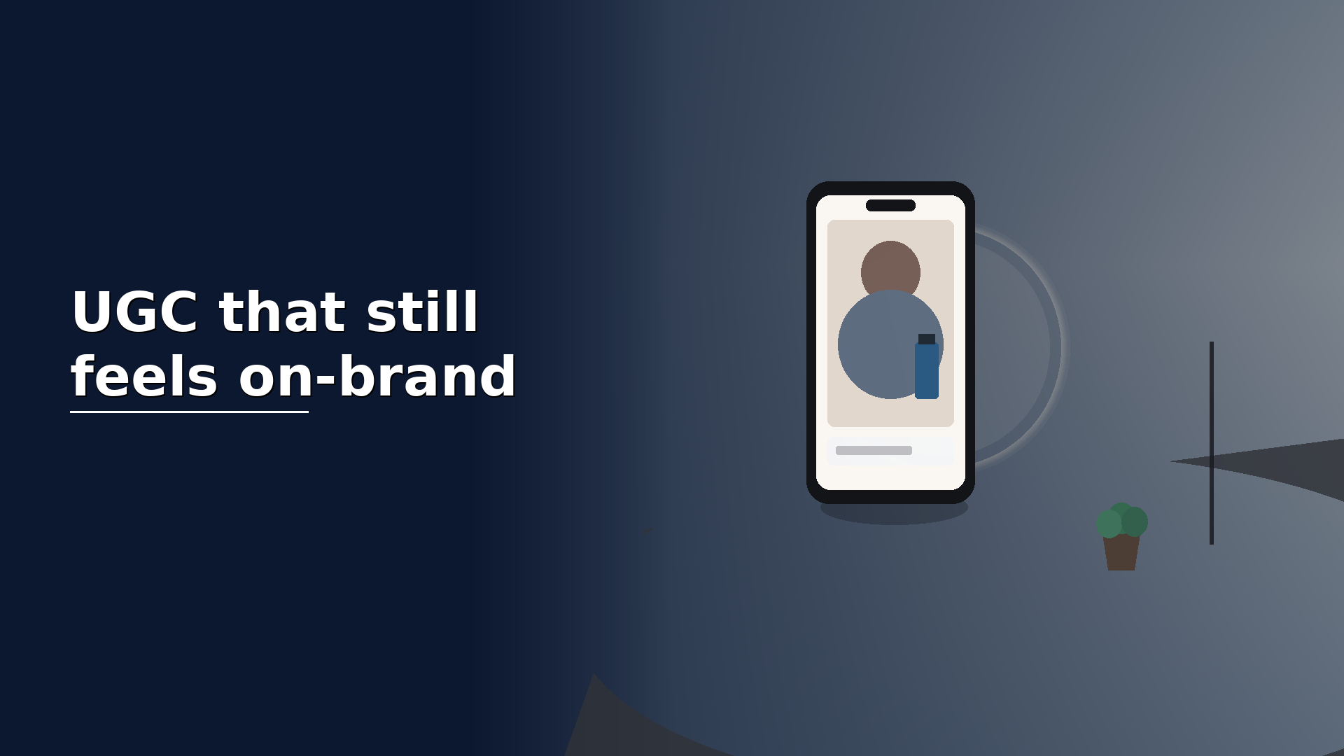
Decide what “on-brand” means before anyone hits record
Most off-brand UGC starts with a vague brief: “just be yourself and talk about the product.” Creators fill the gaps with their own habits. That is fine for personal content. It is risky when your logo, packaging and paid media sit next to the clip.
Write a one-page guardrail doc before the shoot. Cover: the one job of the video (trial, trust, feature proof, unboxing); words and claims that are allowed — and those that are not; visual musts such as logo visibility, packaging orientation and product colour accuracy; soft bans including competitor mentions, medical claims and messy backgrounds you cannot live with.
Keep it short. If the guardrails need a handbook, they will not be followed on a phone shoot.
Brief the look, not a word-for-word script
UGC dies when the creator reads a script like a corporate VO. Give them talking points and a clear outcome instead: “Show how you open the app and find X in under 20 seconds.” Or: “Unbox it, say what surprised you, then show the product in use once.”
Share two or three reference clips that feel right — yours or similar brands — and say what to copy (pace, framing, energy) versus what to avoid. Creators respond better to examples than to adjectives like “premium but approachable.”
If legal needs exact phrasing for a claim, isolate that as a short on-screen line or a single spoken line, then let the rest stay conversational.
Keep the frame casual and the setup intentional
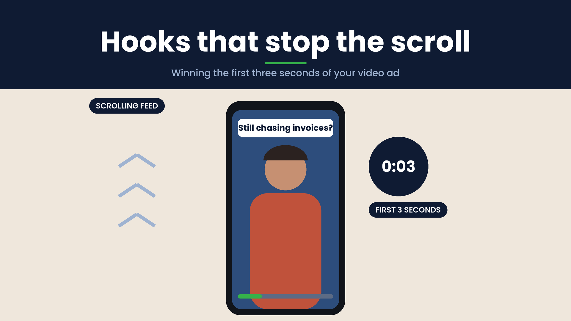
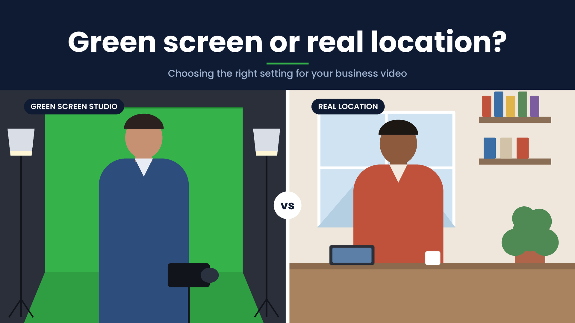
Phone footage can still look brand-safe. Ask for eye-level or slightly above with the product readable in the first three seconds; clean, soft light (window light or a simple ring light beats harsh overheads); a background that is lived-in but not chaotic; and stable hands or a cheap tripod so the brand mark is not a blur.
You are not chasing a studio look. You are removing anything that makes the brand hard to recognise or hard to trust.
Put the brand in the action, not only the caption
On-brand UGC shows the product being handled the way you want customers to experience it. If packaging opens a certain way, show that. If the app flow matters, shoot the screen clearly. If colour is part of the brand, do not grade it into something else in edit.
A practical rule: if you muted the audio, would a regular customer still guess whose product this is within a few seconds? If not, tighten the visuals before you argue about tone.
Leave room for a human voice
Guardrails should protect the brand, not erase the person. Allow natural pauses, imperfect sentences and a little personality — that is why UGC outperforms polished ads in many feeds. Review for accuracy and risk, not for “sounding like marketing.”
When feedback is needed, be specific: “Skip the cure claim” works. “Make it more on-brand” does not.
Use a short review checklist
Before you approve a cut, check: does the opening show the product or problem clearly; are claims and names correct; is lighting and framing good enough that the brand is recognisable; does the tone match your other content in the same channel; and would you be comfortable if this sat next to a paid spot?
If three of five fail, reshoot a section rather than burying problems under graphics.
Keep the process light enough to repeat
The brands that get good UGC at scale treat this as a system: same guardrail page, same reference pack, same review checklist. Creators learn the rails once, then move faster. Marketing spends less time fixing off-brand surprises after the fact.
UGC that feels on-brand is not overproduced. It is guided. Clear rails, a human delivery and a product that stays visible — that is usually enough.